Michelle Cooley is a proud entrepreneur in the Austin, Texas area looking to dive into a new business endeavor. She is hoping to turn a small crafting hobby of hers into a full business, servicing events by providing custom arrangements and decorations.
The idea for her business came after helping to make arrangements for a family member’s wedding. She was hoping to do the same for others under the name Occasions by Michelle. Her plan for creating her arrangements was speaking with her clients to understand what they were looking for. “Every customer is special” were Michelle’s words when creating her arrangements.
When Michelle approached our team, she was looking to have a simple website designed with the added task of creating some business cards. After accepting to take on her project, it was noticed that aside from needing a website for her business, she was also lacking a brand identity. After an assessment of her needs as a business, she accepted the additional work that needed to be done.
The Work Begins
My team went to the drawing board ready to begin researching and crafting the brand. We had dedicated an afternoon to flesh out some concepts and create some marks to play around with. We eliminated a few and were set to show what a few marks that we felt best suited Michelle’s business. She asked us to return to her with a new set of concepts. The team then spent the next few days at the drawing board, discovering what it meant for a customer to choose Michelle’s business, over local competitors, over other event-servicing agencies. Michelle let us know that some colors that were important to her were green and pink. The colors remark helped us lay a basic foundation in a direction we could lead in.
After some revisions we presented concepts we reached in traditional black and white and in color. It was important to let her know we were listening to what she felt was necessary and incorporated that into our work, it also provided great parameters to work with. The project continued after a choice for a mark was made and a direction for style was decided.

Creating A digital Space
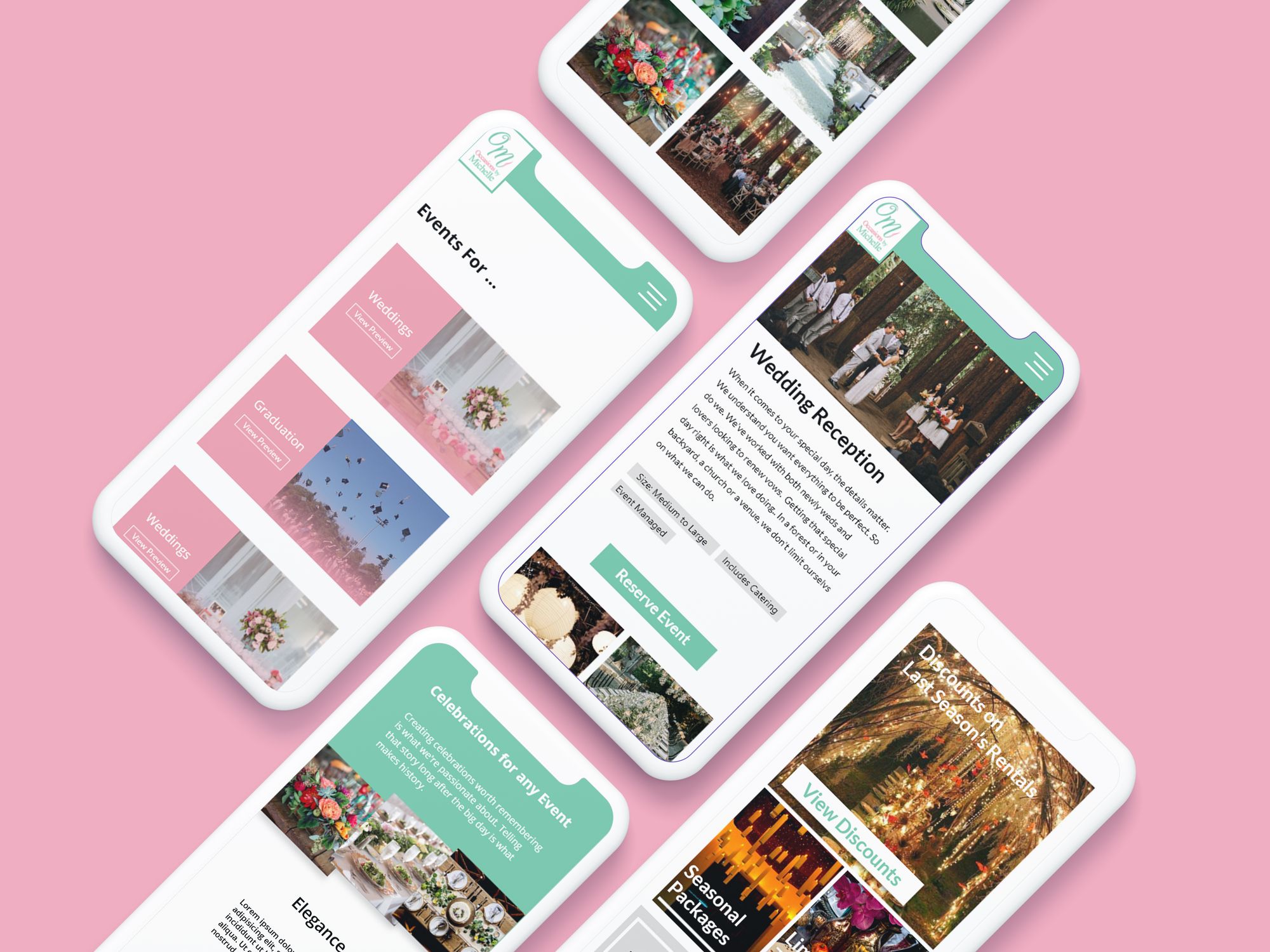
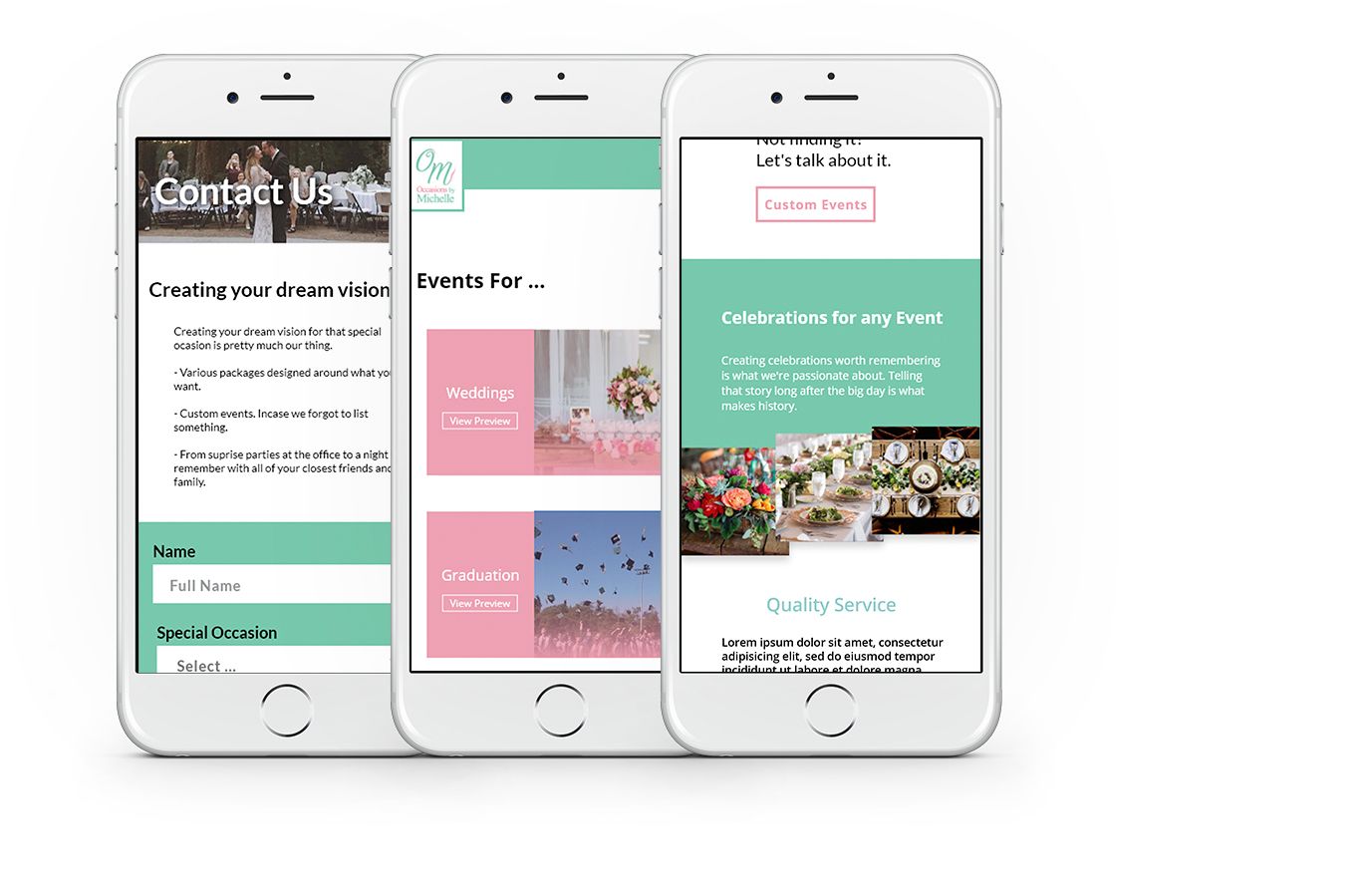
Research began with the question “What are customers looking for?”. My team was led to understand what different types of searches users perform. We used this information to plot out various user journeys to understand what information a user might expect to find and what might help make the content more digestible.
We began to find common patterns and structured information to fit the right patterns and avoid patterns that might disrupt the experience. Each page routing users to what they were looking for and building a path that was quick and to the point with pages and features that were delightful to use. Some concern that popped up were about how to structure pages in a way that allowed more sections of the platform to be added in the future.
The main concern for scalability came from the page for events which itself served as a navigation page. At the moment, Michelle’s business had a handful of event themes to cater around to. The goal would have been, should there be more types of events or other services in the future, the website itself and its pages should be able to easily accommodate that without having to go back to the drawing board to add new content.
Components were designed around this with the idea of Atomic Design in mind. The result was a coherent system of modules to be reused. This led to a quicker development cycle and quick prototyping.