During a busy few weeks, I found myself wishing there was a simple service to call a maid service to look after my messy home. I blew off some steam by coming up with something I thought would be useful for me and possibly others.
Setting up Goals
I began the process by defining how someone would flow through a UI with ease and clarity. In short, how quick can I get someone from Home to conversion in as few clicks. I thought if this product was aimed at busy people, then it would help to simplify the process.

After research has given us behavioral patterns, we are now able to move on to the next step of composing hierarchy of information and apply a visual style guide that can reflect the product's voice and values.
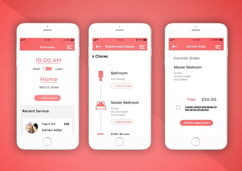
The home page was composed using visual hierarchy that included confirmation that the use is signed in, quick glance at recent service orders, and a way to begin a new service order from the home screen.
Beginning an order from the home screen
Beginning a task from the get-go would be made possible by anticipating what a user, or customer, might do next. A customer could make a quick call to their own residence or have a usual location. By providing pre-populated inputs, we allow a customer to say "yes, my usual location", and click a button to proceed to the next step. A second use for this would be when a customer might think "I have this other spot that needs a quick clean". Being able to tap and edit a pre-populated field could also help with accelerating how quick it is to place an order. instead of hiding a new form to edit location. Another element to be present about this process would be setting up a time for that.

Style Guide
When the hierarchy was set, a style guide was composed to voice the product as friendly, helpful, and encouraging. The idea was to bring a warm voice with a fun type that was legible and readable with fun and unique characteristics all without being too distracting. What came from this search was Katari Rose. A san-serif class typeface designed for readability on screens. To encourage the soft tone of Katari Rose, a soft red monochromatic color pallet was chosen in combination with soft grays.


It was fun project to let off steam and do something on my own terms to prevent burnout.