Understanding Intentions
The goal for direct deposits with Citi is to allow customers to sign up for direct deposits without the hassle of back-and-forth paperwork. The problem we set out to solve for our customers AND business was "How might we make direct deposits easier?"
Our research has suggested that our customers are more likely to remain customers in addition to applying for credit, open mortgages, and more. This opens our opportunity to deepen our relationships with customers, which gives us the responsibility to provide better services and features that benefit our customers and our value to them.The goals set forth focused on taking an inherited product and moving it into the latest design language, enhancing usability, and addressing the drop off to completion ratio as our conversion measure.
Dusting Off the Shelf.
Inheriting an MVP for our online web and iOS product platforms, my introduction to the product was to lead efforts to adjust the product to make space for future enhancements.

My team had positioned ourselves to take on a large drop off rate for a high visibility and high impact area of business. We were tasked with Improving the design and encouragement to engage in user testing. Our goal was to convert new-to-Citi customers, and customers with a partial relationship to Citi, into forming deeper relationships with us. Once a customer has registered for direct deposits with a primary income source, they are most likely to also take out credit, open a mortgage, or other "sticky behaviors" likely to create life-long customer relationships.
Working Backwards From the End-Point
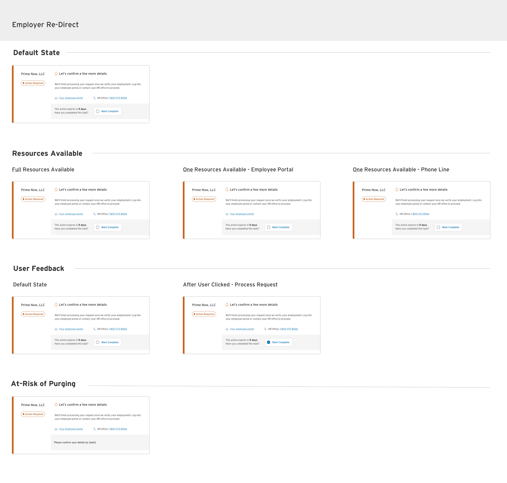
Breaking ground began with creating a dashboard of users to circle back to check the status of their direct deposit request. The problem we wanted to solve with this product was "How might a customer check on the status of their own direct deposits". The Status Hub, as it was known on the business side, consisted of separate tiles for each electronic deposit request. When a request was sent, a response was given according to four different indicators - Active, Pending, and two different variations of "Action Required".


Redesigning our Online Banking Channel
With our online banking channel, we had a bit of a larger drop off than on mobile. We took into account the differences between the two experiences and narrowed our focus down to two parts of the funnel with our online banking platform.
Our product manager, Eyal, had targeted the results page to be tackled first.

Our product manager had consulted with a behavioral scientist on what might be turning customers off to the idea of completing registration for direct deposits. He had made a few recommendations. My team had followed through with the requirements set forth as well as providing recommendations ourselves of our suggested HCD approach with new patterns.

There is an understanding that by providing “back pocket” ideas, we had sought to deride from adjacent professional opinion by furthering initial ideas with complementing usability patterns to solve for engagement and a smooth experience.
After testing, we had little time to turn out a second test to address adjusted assumptions. At this point, we made a decision to adjust our sails and ship what we had to our best understanding according to our experiences with human-centered design and user feedback.

As much fun as it was working with various specialites such as researchers, product managers, a junior designer, and a copywriter; I do wish we had less restrictions and the ability to start from the ground up. I do believe in our product and my team to indulge and thrive with innovation. Only so much can go into a sprint at a time. With this in mind, this product is constantly being worked on with encouragement all around to try new things.