Problem to Solve:
On our native channels, we don’t have any way for users to search, explore and apply for checking accounts and banking products in general.
The Ask:
Create a user friendly approach to the product shopping experience on our native mobile channels. Provide the ability to user to find the right package for what they are looking for and have it be easily understood.
The Approach:
Create a MVP product that gives users an easy way to find the right account and apply. Post MVP, as a fast follower, enhance the experience based on business and product goals while balancing the users needs
"What's out there?"
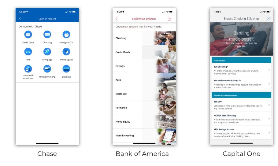
Crafting an ideal experience would take into account current standards across competitors. Taking a deep dive into how our competitors guided their audiences to find the right products reavealed common patterns among established firms like Chase, Bank of America.
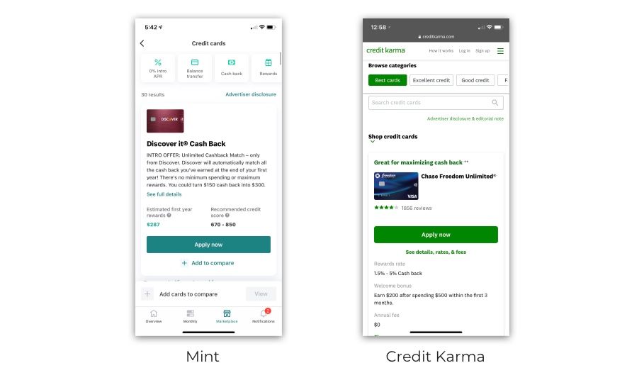
Research has also turned up an interesting showcase of younger competitors when speaking to navigation that is customer-centric, innovative, and easy to use.
Beginning the explorations
The start of our ideation process began in InVision freehand. Our team had begun to ideate on "How might customers search for a package?". We had explored some solutions on how we might go about in crafting the right experience. Imagining what our MVP could be and leaving room to expand from checking to savings and beyond.
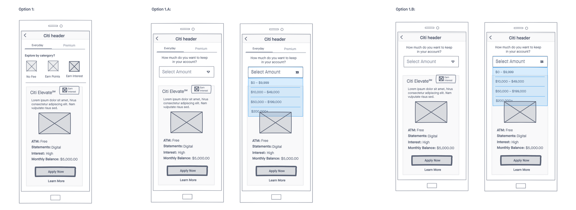
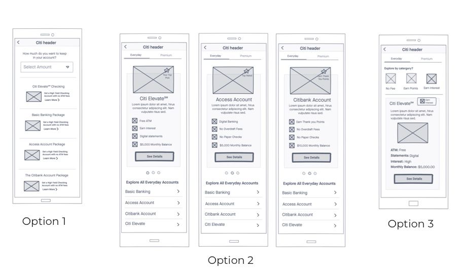
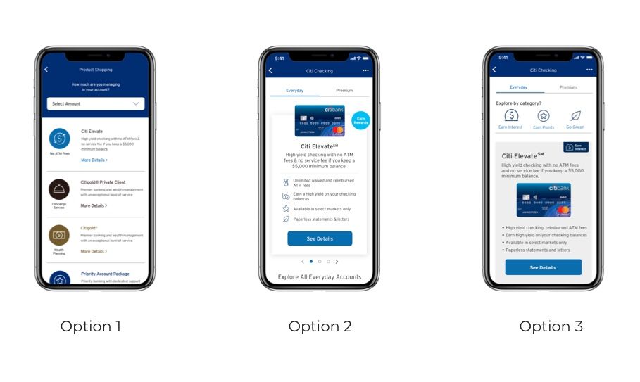
Option 1:
1:
Our directory is divided by two tabs. One tab hold average joe, or "Everyday" accounts. The second tab would hold accounts that are tailored to wealthier clients.
Upon landing in "Checking", our directory defaults to "Everyday" accounts. Users can decide to narrow down shown results by exploring by category. If a customer explores by category, the other accounts, will be placed below the categories listed.
1.A:
Rather than a customer selecting a wealth option, we chose to consider equity and add a filter, rather than categories and allow a customer to choose which banking product most fits their needs by selecting a range that suggests how much they might be holding in their account.
1.B:
We decided to nix the idea of separating the directory by tabs and go straight for filtering out what range a customer might fit in.
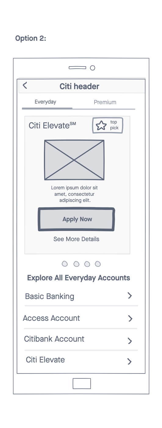
Option 2:
Our second option would hold each result by card. A user can swip via carousel and decide which account would best suite them. The idea for the card came from allowing the business to upsell accounts by creating a place for high priority. A badge would be present that can represent "Top Pick" or other categories. Below the card, a customer can view other related bank account packages by name.
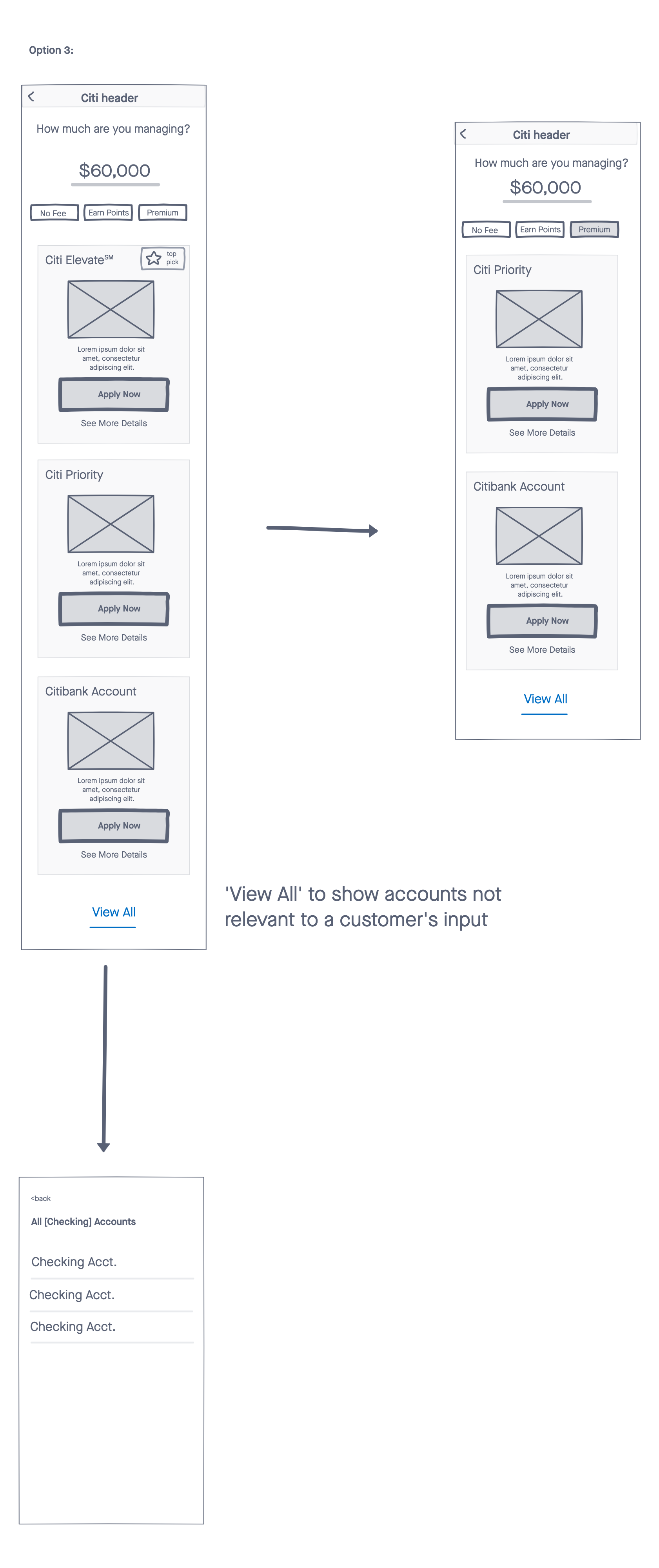
Option 3
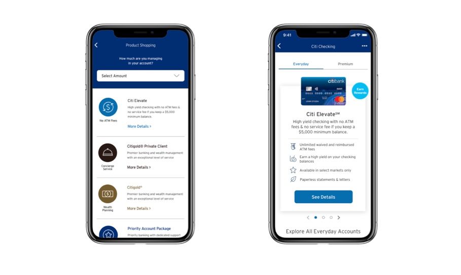
Option 3 would bring in the idea of asking how much a customer might want to hold in their Citi bank account. This would immediately show customer which banking products best fit their customer tier. A customer can then filter down the results by selecting filters that describe specific perks of their liking. A customer might be holding a monthly average of $60,000, which can results in about 3-4 results. A customer can then choose a filter such as a "Premium" account. This filters down to 2 results a customer can then choose between. This narrows down results to an appropriate accounts for their lifestyle.
Testing
Taking our product into testing meant we had to narrow down what we wanted to test. We had separated our ideas into 3 different features. The categories selection, a list-view as our default, and the carousel.
Key Learnings
Users overall liked the list view. They felt it gave them a clear picture of what they would be looking for in their budget clearly. They also felt that if they wanted to learn more than would have to tap into them. Users liked the flags on the horizontal swipe for a key benefit.